


UnitedHealthcare Medicare Shopping / Online Enrollment
Primary challenges to solve for:
Declining completion rates
Enrollment starts were increasing, but fewer users were finishing the application, signaling friction within the experience.
01
Complex, high-effort process
The enrollment flow felt long and overwhelming, especially for users unfamiliar with Medicare or applying on mobile devices.
02
Low confidence and clarity
Users lacked visibility into progress, weren’t sure what information was needed, and had limited guidance when they got stuck.
03
My role as UX Director at UnitedHealthcare:
I led the UX team end-to-end, from initial research and user flows through hands-on design (and design concepting), presentation, prototyping, developer handoff, and usability testing in partnership with our internal research team.
Objectives
Increase enrollment completion rates with a redesign of the enrollment experience by simplifying the application process, improving usability across devices, and building user confidence through clearer guidance, consistency, and transparency.
Approach
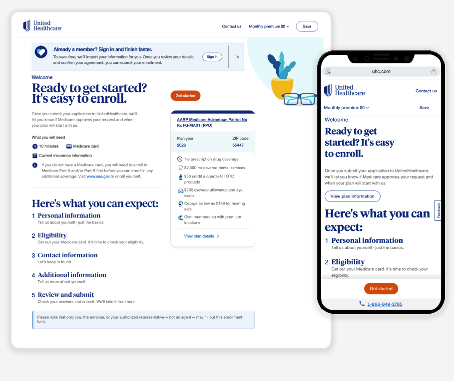
Re-mapped the end-to-end enrollment journey to identify drop-off points and streamline the flow
Established reusable page templates to create a consistent, predictable experience
Aligned the experience with the design system to modernize UI and improve scalability
Introduced progress indicators and “Before you begin” guidance to set expectations upfront
Added contextual help and input formatting to reduce friction and errors
Designed with accessibility in mind to support a broad range of users and abilities
Results
Increased enrollment completion rates
Reduced drop-off throughout the application process
Improved mobile usability and overall experience efficiency
Increased user confidence when completing a complex healthcare application