

UI upgrade:
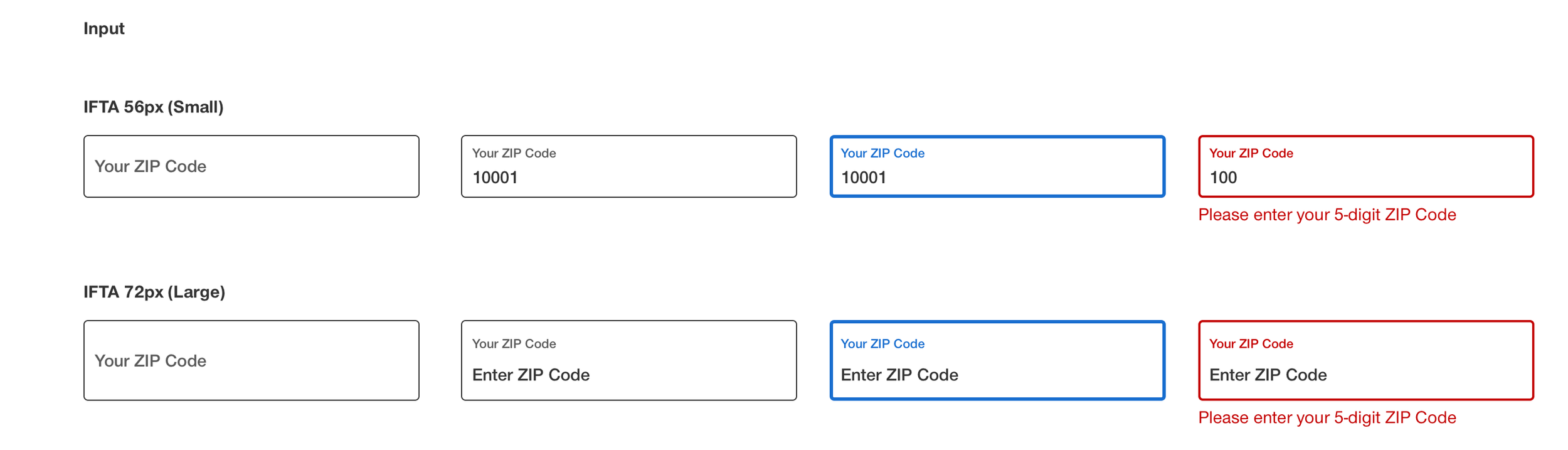
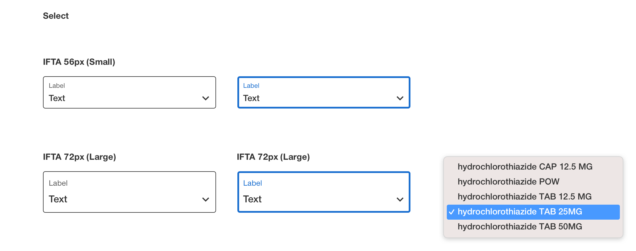
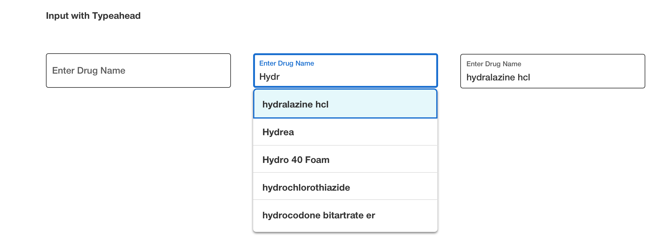
In field top aligned (IFTA)
Experience objectives to solve for:
Long forms felt heavier than they needed to
With labels positioned outside and above each field, forms consumed a large amount of vertical space. On mobile especially, this created excessive scrolling and made the experience feel longer, denser, and more time-consuming than it actually was.
01
The visual weight of the form increased perceived complexity
Even when the steps themselves were manageable, the layout made the enrollment process appear more complicated at first glance. Too much space between labels and inputs created a taller, more fragmented experience that could feel intimidating to users.
02
Input patterns lacked the familiarity users see in modern digital products
Many users were already accustomed to in-field label behavior across products from Apple, Google, and other mainstream platforms. Adopting a more familiar and contemporary input pattern created an opportunity to make the experience feel more intuitive and current without requiring users to learn something new.
03
Background & Objectives
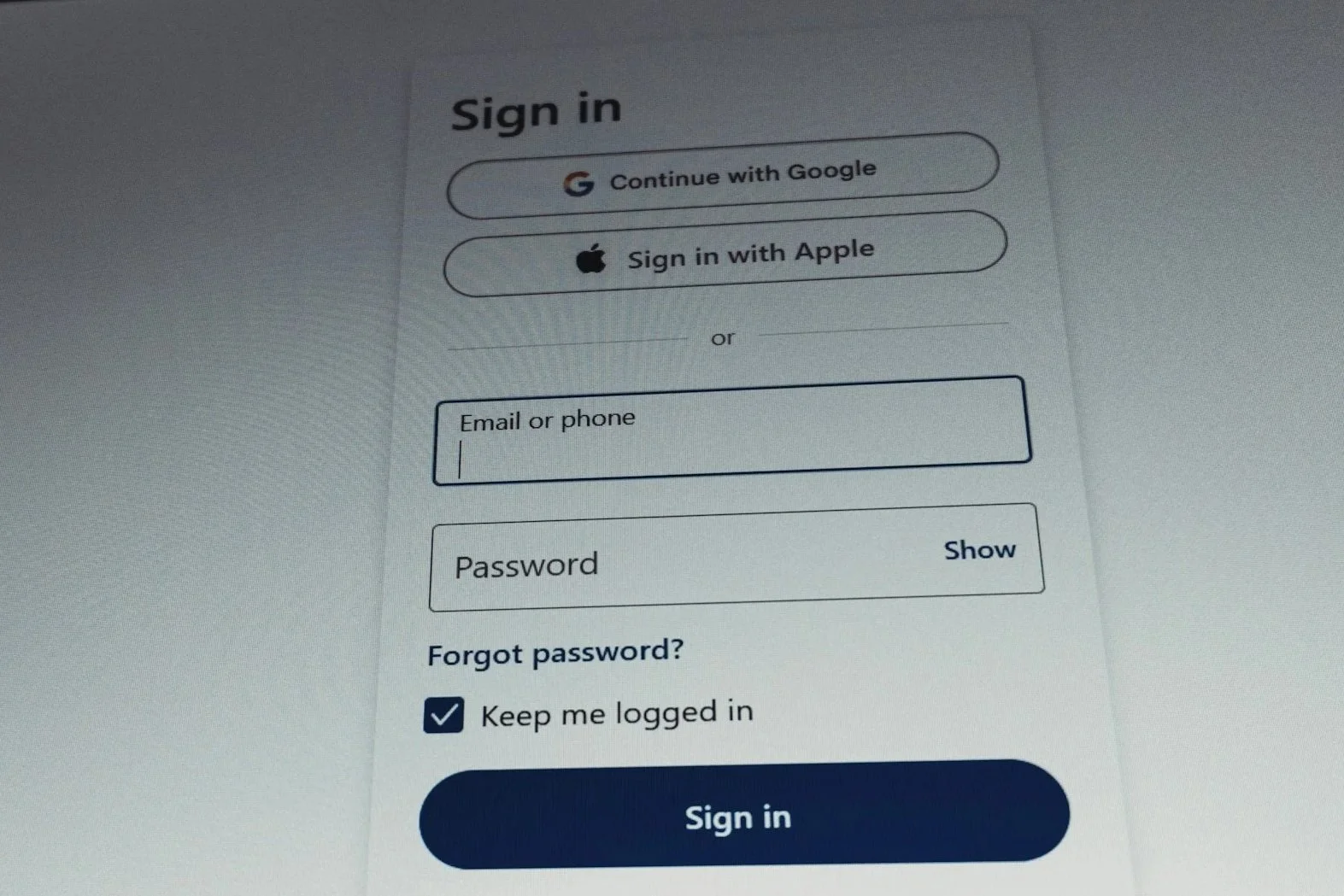
As part of leading UX for the UnitedHealthcare Medicare enrollment experience, I identified an opportunity to modernize our form patterns by replacing traditional externally positioned labels with in-field top-aligned inputs.
The existing form structure was functional, but it introduced unnecessary vertical bulk, especially across longer enrollment flows. This was even more noticeable on mobile devices, where users had to scroll more frequently and the overall experience could feel longer and more complex than intended.
The objective was to create a cleaner, more space-efficient pattern that would:
Reduce vertical scrolling, especially on mobile devices
Make long forms feel more compact and less overwhelming
Improve the overall visual clarity and modern feel of the experience
Leverage a more familiar interaction pattern already common in leading consumer products
Establish a scalable input standard for broader use across the design system
Approach
Modernizing the input pattern
I led the initiative to transition from traditional external labels to IFTA inputs, where the label begins within the field and moves into a top-aligned position inside the input container as the user engages.
This approach allowed us to preserve clarity while significantly reducing the amount of vertical space each field required.
Designing for compactness without sacrificing usability
The IFTA pattern was intentionally selected because it:
Eliminated the need for a separate label row above each field
Reduced overall form height and minimized scroll depth
Created a cleaner, more consolidated visual rhythm
Helped forms feel simpler and faster to complete
Supporting familiarity and ease of use
An added benefit was pattern familiarity. Many users were already engaging with similar field behavior in everyday products from Apple, Google, and other widely used digital platforms. Bringing that same interaction model into our experience helped the interface feel more intuitive, modern, and immediately understandable.
Testing and refinement
We refined spacing, label positioning, and interaction behavior to ensure the pattern remained clear, accessible, and easy to use across devices, with particular focus on mobile layouts and longer enrollment flows.
Systemizing the pattern
Once validated, the component was incorporated into the broader design system with guidance for structure, behavior, accessibility, and reuse across other form-based experiences.
Results
Reduced vertical space across long forms, especially on mobile
Decreased perceived complexity by making the experience feel cleaner and more compact
Improved scanability and overall visual organization
Introduced a more modern, familiar interaction pattern aligned with leading consumer platforms
Created a scalable component that could be extended across additional form experiences