Pampers
Gifts to Grow App
Experience objectives to solve for:
Turning friction into flow
The experience depended on quick, accurate code entry in real world conditions. Users were often multitasking, dealing with poor lighting, or switching between scanning and typing. Even small points of friction created drop off.
Design Challenge:
Create a fast, forgiving entry experience that works in imperfect conditions and minimizes cognitive load from the first interaction.
01
Bridging physical and digital
The core interaction asked users to translate a code from packaging into a digital reward. Without clear guidance and feedback, this connection could feel unreliable or confusing, especially when scans failed or took multiple attempts.
Design Challenge:
Make the connection between physical code and digital reward feel immediate, clear, and trustworthy through guidance and responsive feedback.
02
Sustaining engagement over time
The value of the experience wasn’t just in a single successful code entry, but in repeat participation. Without a sense of progress or reward momentum, the interaction risked feeling transactional rather than motivating.
Design Challenge:
Turn a one time task into a repeatable loop by reinforcing progress, value, and small moments of reward.
03
Background & Objectives
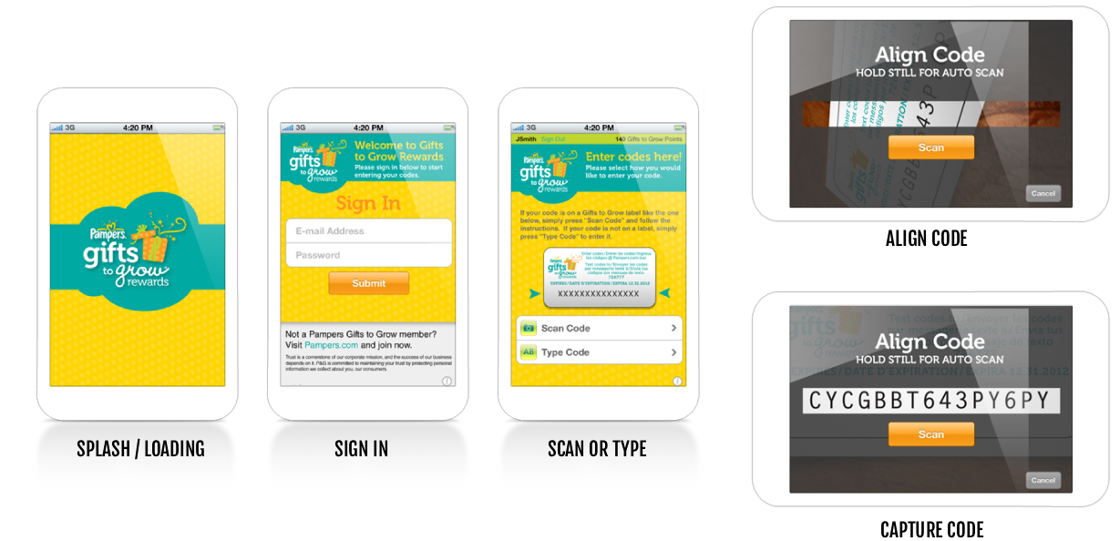
The Pampers Gifts to Grow program was designed to reward parents for purchasing Pampers products by allowing them to enter or scan codes from packaging to earn points from the app.
The objective was to create an experience that made this process feel fast, intuitive, and dependable while reinforcing the value of participation. Success meant reducing friction at the point of entry, increasing completion rates, and encouraging repeat engagement over time.
Approach
I led the UX design end to end, focusing on simplifying the interaction model and designing for real world use, not ideal conditions.
The experience was structured around a few key principles:
Reduce decision friction by presenting scanning and manual entry as equally clear, accessible paths
Design for imperfect environments with strong visual guidance for scan alignment and forgiving input patterns
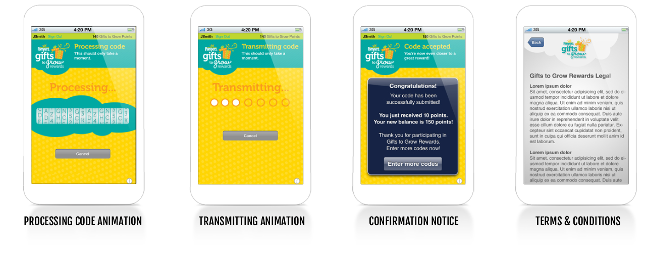
Make the system feel responsive through clear processing and transmitting states that reassured users progress was happening
Reinforce behavior loops by elevating the reward moment into something visible and motivating, not just informational
I worked closely with product and engineering in the development of the app to ensure the experience balanced usability with technical constraints, particularly around camera scanning and code recognition.
Results
The final experience improved both usability and engagement by removing friction and increasing clarity at key moments.
Increased successful code submissions by simplifying entry paths and reducing failure points in scanning (be it by scanning, or manual text entry)
Improved completion rates through clearer system feedback and more predictable interactions
Reduced user frustration by making the process feel guided and responsive, even when scans weren’t perfect
Strengthened repeat engagement by turning confirmation into a moment of progress, encouraging continued participation
The results in usability and post-launch was an experience that feels quick, reliable, and quietly rewarding, something users can complete in seconds, but return to consistently.