Experience Design
From complex problem spaces to elegant experiences, I design alongside my teams in braiding together the strategy, research, design systems, and product thinking to all work together.
Featured Project / 01

UnitedHealthcare Medicare Shopping / Online Enrollment
Primary challenges to solve for:
A higher level of enrollments
Each piece is made with attention to detail, ensuring quality you can trust and a finish you’ll be proud to show off.
01
Simplify the experience to reduce drop off rates
From texture to tone, we consider the small things—because they’re what make a product truly stand out.
02
Enable users with an increased sense of confidence
Our products aren’t just nice to look at—they’re built to integrate into your life with ease, purpose, and durability.
03
Challenge
UnitedHealthcare’s Medicare Advantage online enrollment tool was attracting strong traffic, but application completion rates were declining.
While enrollment starts continued to grow year over year, fewer users were finishing the process, especially on mobile. At the same time, the audience had broadened to include users with varying levels of technical comfort and different accessibility needs.
Several issues were contributing to friction:
A complex, high-stakes process
Applying for Medicare coverage requires users to provide detailed personal, medical, and eligibility information. Many users were unfamiliar with the process and uncertain about what information they would need.
Lack of clarity and confidence during the application flow
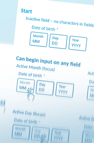
User testing revealed participants often didn’t know where they were in the process or how much work remained. This uncertainty led to hesitation and abandonment.
Fragmented interaction patterns
The enrollment flow had evolved over time using older design systems and inconsistent UI patterns, which created a disjointed experience across steps.
Mobile usability gaps
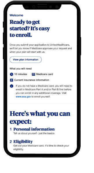
Traffic from mobile devices had increased significantly, but the experience had not been optimized for smaller screens or touch interactions.
Diverse user scenarios
Personas ranged from newly eligible individuals turning 65 to caregivers applying on behalf of family members, as well as existing members comparing plans or switching coverage. Each group approached enrollment with different levels of knowledge and confidence.
My UX team’s goal was to increase enrollment completion rates while improving clarity, usability, and trust throughout the application journey.
Approach
Grounding the experience in real user needs
Prepare users
Users wanted to prepare before starting so they wouldn’t get stuck mid-application.
“ It’s always helpful when someone gives you a heads-up to get something ready with a little advance notice. ”

Show progress
Participants struggled to understand where they were in the process.
“ I’m not totally sure where I am in it. Maybe about half way through? I didn’t see anything that shows how far along you are.”

Assist users
Accessibility usability improvements like formatting assistance or contextual help significantly.
“It would have been easier if the letters were capitalized automatically so I didn’t have to do it myself.”
For example, participants responded positively when the experience explained what documents they would need before starting, such as a Medicare card or insurance details.
These insights shaped design priorities across the entire flow.
Re-mapping the end-to-end enrollment journey
Key benefits of the flow redesign included:
Identifying steps where users most commonly abandoned the process
Reducing redundant pages
Clarifying the sequence of required information
Creating alignment between design, product, and engineering teams
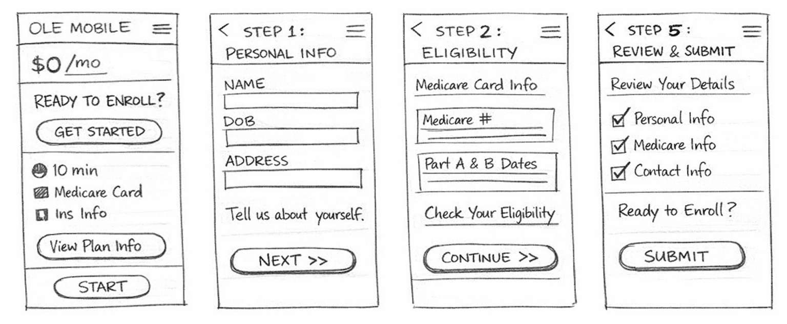
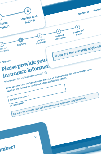
The final structure organized the experience into clear stages:
Personal information
Eligibility verification
Contact information
Additional coverage details
Review and submit
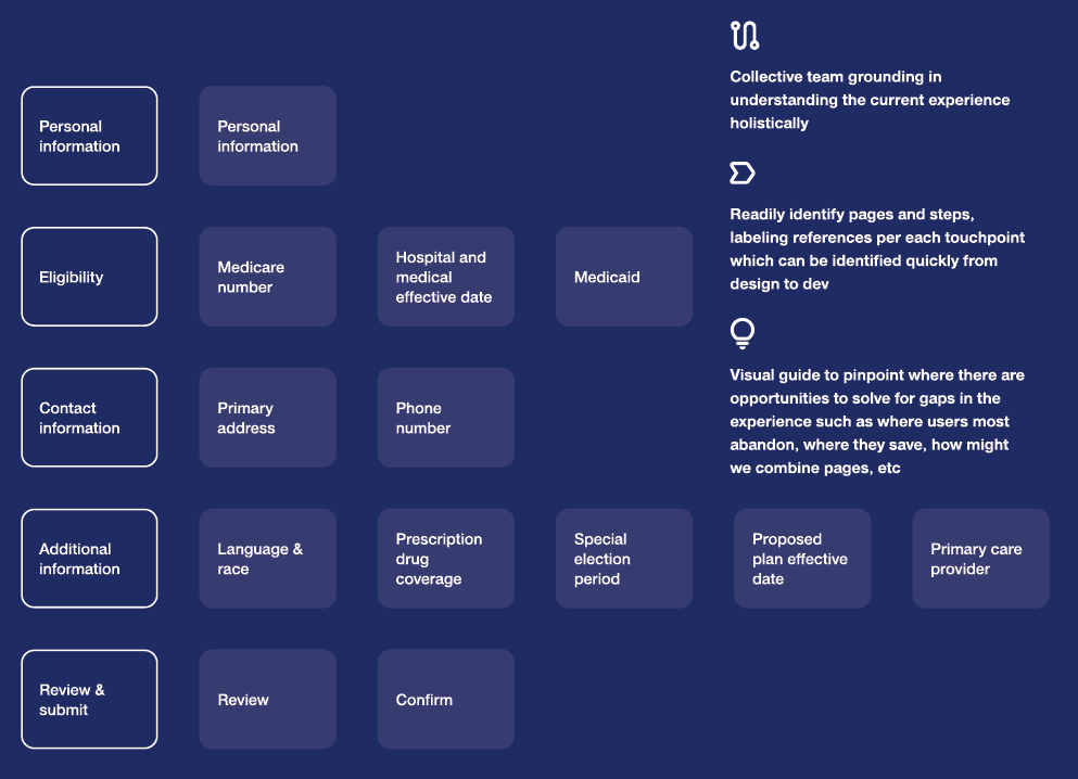
This structure helped establish a predictable rhythm that users could follow confidently from start to finish.
Establishing clear page templates
To improve consistency and scalability, our team created a system of reusable page patterns.
These templates defined the structure for the entire application experience:
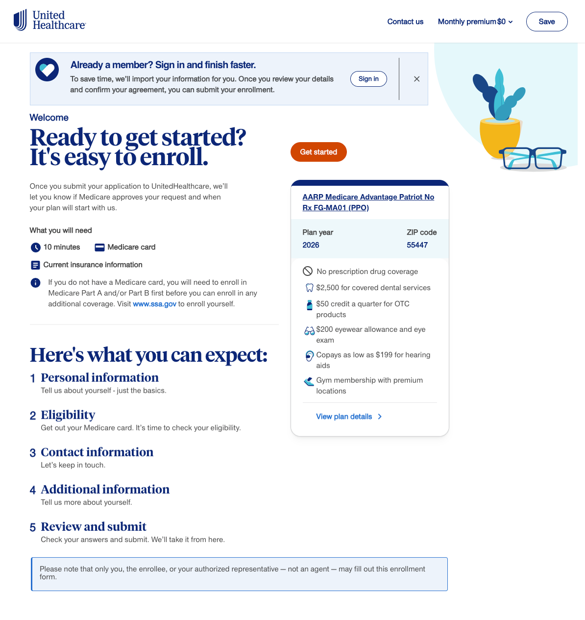
Welcome page
Introduced the process and helped users prepare by outlining what information they would need.
Section landing pages
Signaled the beginning of a new stage and reinforced progress.
Input pages
Focused, task-oriented screens where users entered or confirmed information.
Review pages
Allowed users to verify their entries before submission.
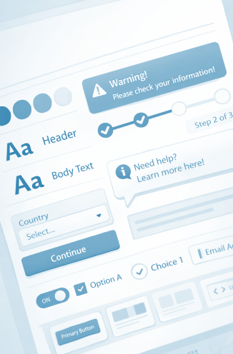
Integrating the design system
The redesign aligned the enrollment experience with the company’s design system, bringing modern UI components and accessibility improvements into the product.
Design system elements introduced included:
standardized alerts and notifications
improved progress indicators
contextual help popovers
accessible form controls
consistent visual hierarchy
By aligning with the broader system, the experience gained both visual cohesion and engineering efficiency.
Increasing transparency and reassurance
Healthcare enrollment can feel intimidating. The redesign added cues to boost user confidence.
Key improvements:
Progress visibility: persistent indicator shows users’ place in the process.
Preparation: “Before you begin” notes ~10-minute duration and required documents.
Contextual help: info icons explain complex fields without leaving the flow.
Formatting: fields auto-format inputs to reduce errors.
User testing showed these changes increased comfort completing the application.
Accessibility and inclusive design
Because Medicare applicants include older adults and individuals with varying technical abilities, accessibility was a critical consideration.
The redesigned experience followed the branded accessibility guidelines, including:
keyboard-accessible help elements
descriptive field guidance
clear labels and instructions
accessible error messaging
These changes ensured the tool was usable for a broader range of applicants.
Results
✅ Impact at a glance
Increased enrollment completion rates
Reduced drop-off throughout the application process
Improved mobile usability
Greater user confidence during a complex healthcare decision
The redesigned enrollment experience produced measurable improvements in both usability and business outcomes.
Improved completion rates
Simplifying the flow and increasing transparency helped reverse the decline in start-to-complete conversions.
Reduced application abandonment
Clear progress indicators and preparation guidance removed uncertainty that previously caused users to drop off.
Better mobile performance
Mobile-friendly layouts and simplified input flows improved usability for the growing number of mobile applicants.
Higher user confidence and satisfaction
User testing showed participants appreciated:
knowing what to prepare before starting
being able to track their progress
quick access to contextual explanations
These changes helped transform the enrollment experience from a confusing process into a guided journey that felt manageable and trustworthy.
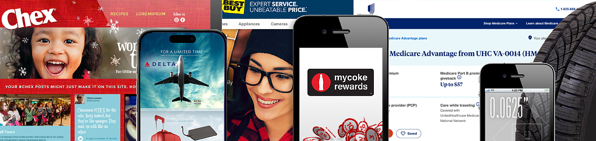
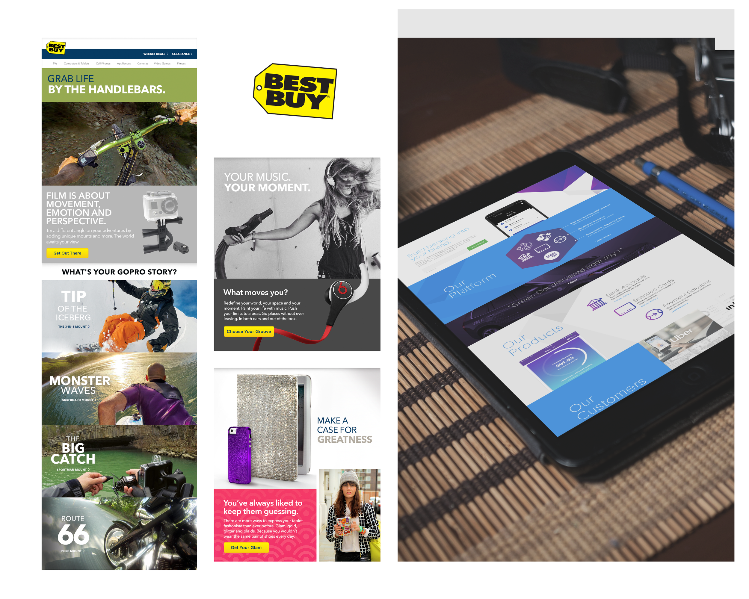
Selected Work / 02

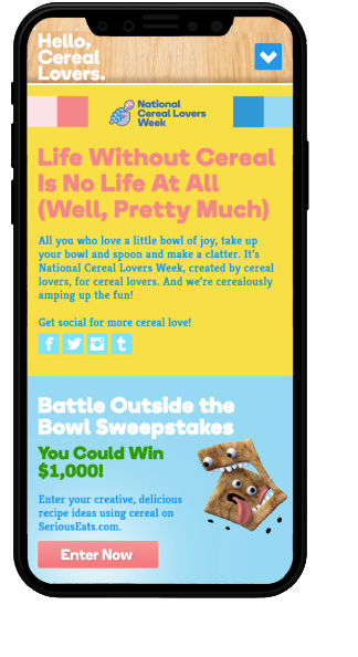
General Mills
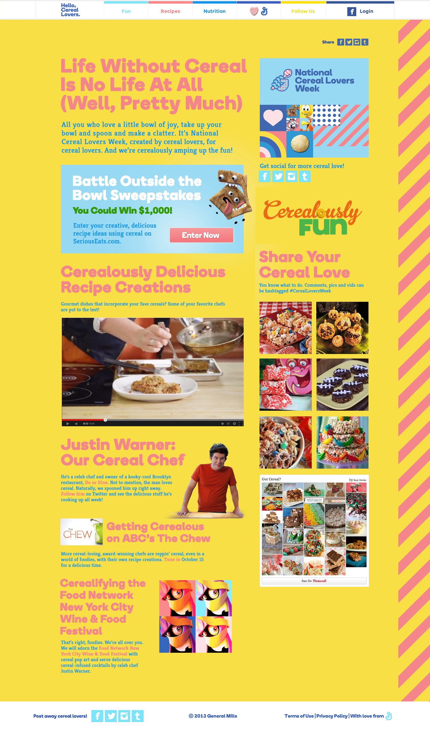
Hello, Cereal Lovers
Primary challenges to solve for:
Reclaim Breakfast Relevance
Cereal had quietly slipped from its throne as a go-to breakfast, edged out by options that felt more modern, portable, or health-forward. The challenge was to reinsert cereal into people’s daily consideration set not by competing head-on with nutrition trends, but by reframing its value. This meant reminding consumers that cereal wasn’t just fuel, it was ritual, comfort, and a small daily moment of joy worth returning to.
01
Turn Nostalgia into Participation
While many people had fond memories of cereal, nostalgia alone wasn’t enough to drive behavior change. The opportunity was to transform passive sentiment into active engagement by inviting people to celebrate cereal culture in a more expressive, communal way. This required creating a platform where fans could see themselves reflected, contribute their own takes, and feel like part of something larger than a single campaign.
02
Bridge Brand Storytelling with Digital Experience
To bring the campaign to life, the digital experience needed to carry the same energy as the broader campaign while offering something uniquely interactive. The website became the connective tissue, translating broadcast and social storytelling into an experience users could explore, engage with, and share. It balanced playful content with intuitive design, ensuring that the tone felt spontaneous while the experience itself remained seamless and accessible.
03
Challenge
By the early 2010s, traditional cold cereal was losing ground at breakfast to trendier and perceived healthier options like yogurt, smoothies, and oatmeal. Despite being present in the vast majority of American households, cereal consumption had been gradually declining as consumer habits shifted toward more portable or protein-focused morning foods.
General Mills set out to reignite excitement around cereal by reminding people why they loved it in the first place. The goal was to reposition cereal not just as a breakfast routine, but as a nostalgic, playful cultural staple worth celebrating again.
Approach
The Hello, Cereal Lovers campaign was designed as a connected ecosystem of storytelling, social engagement, and digital experience, with the website as its central hub. I led the end-to-end UX for the site, ensuring it reflected the campaign’s playful tone while remaining intuitive and accessible.
I conducted discovery and research to understand shifting breakfast behaviors, then translated those insights into wireframes and interaction models that supported an exploratory, content-rich experience.
I also designed for social media integration, surfacing user-generated content and enabling seamless sharing to extend engagement beyond the site.
In parallel, I contributed to the branding and visual design, including creating the campaign tagline “Cerealously Fun,” which helped define the voice of the experience across touchpoints.
Results
What began as a campaign quickly grew into a social community celebrating cereal culture. The initiative generated strong engagement across social platforms, with hundreds of thousands of followers participating in the conversation and sharing cereal-inspired content.
Most importantly, the campaign helped reverse declining momentum for the category. During the campaign period, General Mills reported a 4% increase in cereal sales, demonstrating that celebrating nostalgia and community around a product could translate directly into renewed consumer demand.
The campaign also received industry recognition for its innovative use of social storytelling and integrated media, proving that even a decades-old category could find new life through a creative digital-first approach.